Scalar UI
Marketing UIApp UIAIChartsBackgrounds
Sign inGet started
Scalar UI
Scalar UI© 2026 Scalar Limited

React · Tailwind CSS · Motion

Browse

HomeAll components 213

Collections

Marketing UI 107App UI 94AI 16Charts 45Backgrounds 2Text 43

More

Text 43

Getting started

Installation

Primitives

AccordionsAlert DialogsAlerts2Aspect RatiosAvatars2BadgesBreadcrumbsButton GroupsButtons2CalendarsCheckboxesCollapsiblesComboboxesCommand MenusContext MenusDate PickersDialogsDropdown MenusEmpty StatesFields2FormsHover CardsInput OTPInputs3KbdMenubarsNavigation MenusPaginationPassword InputsPopoversProgress2Radio GroupsResizableScroll AreasSelectsSeparatorsSheetsSkeletonsSlidersSpinnersSwitchesTablesTabsToastsToggles2ToolbarsTooltipsSortablesStatus DotsTree ViewsFile UploadsSteppers

Layouts

SidebarsNavbarsApp Shells

Blocks

SchedulersBoards3CanvasesWorkflowsAI apps4Developer tools3AuthenticationOnboardingSettingsPricing & upgrades2Help & feedback4System pages7Admin console

Other

Cards

Resources

Docs & installScalar Design
App UIPrimitives

Avatars

People and teams as images or initials.

PreviousAspect RatiosNextBadges

On this page

AvatarFallbackSizeStatusRoundedGroupWith NameAvatar UploadWorkspace LogoOverlayCropper

Avatar

Radix avatars with image and initials fallback, five sizes, round or rounded shapes, status dots and overlapping groups that spread on hover.

radix-ui

Fallback

Initials in a soft color picked from the name, or your own icon.

Size

xs, sm, md (default), lg and xl.

Status

online, away, busy and offline.

Rounded

shape="rounded" for teams and organizations.

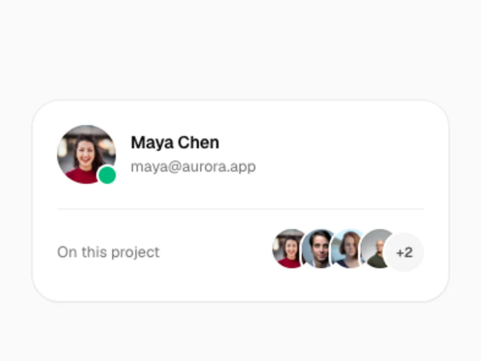
Group

AvatarGroup with max shows a +N bubble.

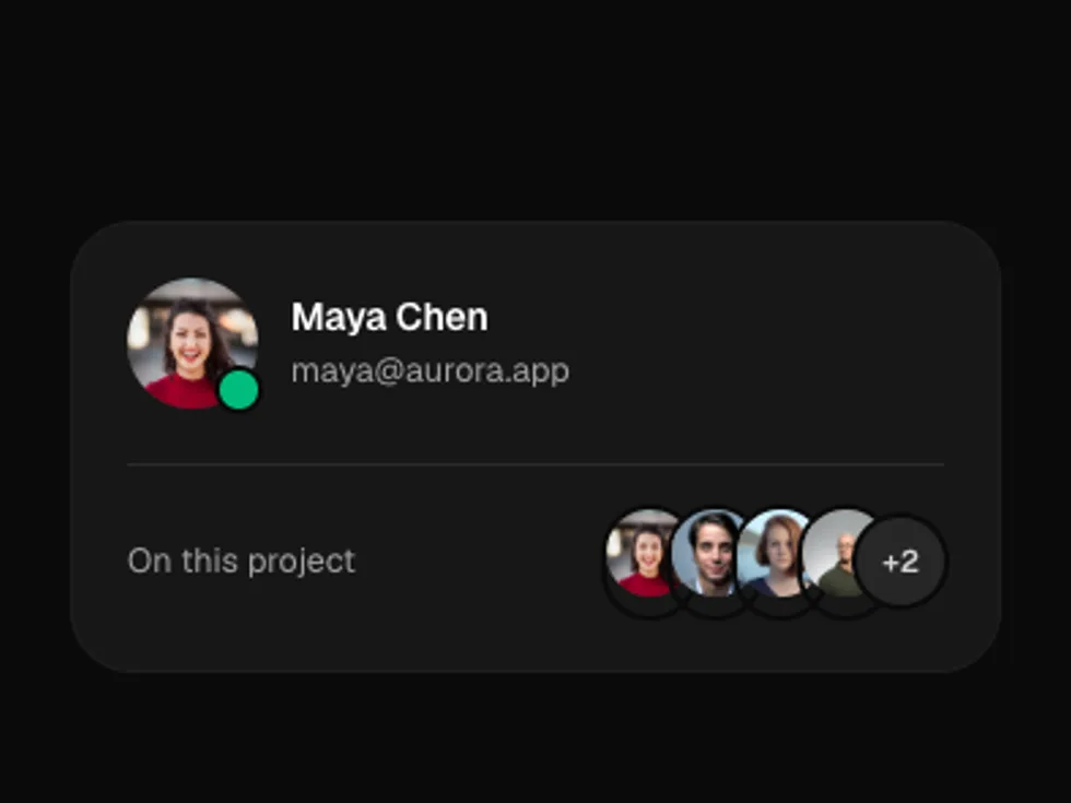
With Name

An avatar beside a name and email.

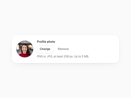
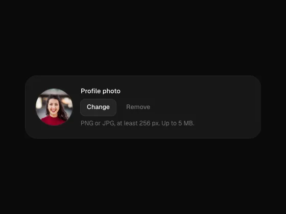
Avatar Upload

A profile photo or logo you can click or drop onto, cropped in a dialog with drag, zoom and arrow keys, saved as a 256 px image. Falls back to coloured initials when removed.

radix-ui · motion · lucide-react

Workspace Logo

A square logo with initials until one is added.

Overlay

A large avatar with a camera badge, for onboarding.

Cropper

The crop area on its own with live previews at three sizes.