Scalar UI
Marketing UIApp UIAIChartsBackgrounds
Sign inGet started
Scalar UI
Scalar UI© 2026 Scalar Limited

React · Tailwind CSS · Motion

Browse

HomeAll components 213

Collections

Marketing UI 107App UI 94AI 16Charts 45Backgrounds 2Text 43

More

Text 43

Getting started

Installation

Primitives

AccordionsAlert DialogsAlerts2Aspect RatiosAvatars2BadgesBreadcrumbsButton GroupsButtons2CalendarsCheckboxesCollapsiblesComboboxesCommand MenusContext MenusDate PickersDialogsDropdown MenusEmpty StatesFields2FormsHover CardsInput OTPInputs3KbdMenubarsNavigation MenusPaginationPassword InputsPopoversProgress2Radio GroupsResizableScroll AreasSelectsSeparatorsSheetsSkeletonsSlidersSpinnersSwitchesTablesTabsToastsToggles2ToolbarsTooltipsSortablesStatus DotsTree ViewsFile UploadsSteppers

Layouts

SidebarsNavbarsApp Shells

Blocks

SchedulersBoards3CanvasesWorkflowsAI apps4Developer tools3AuthenticationOnboardingSettingsPricing & upgrades2Help & feedback4System pages7Admin console

Other

Cards

Resources

Docs & installScalar Design
App UIPrimitives

Calendars

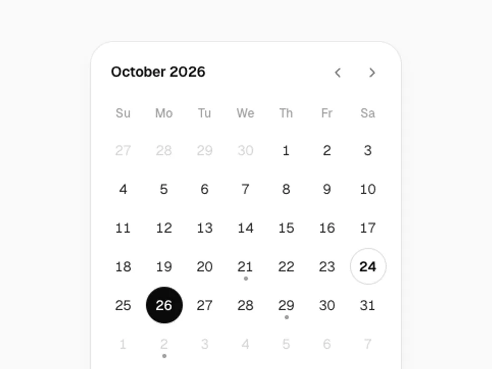
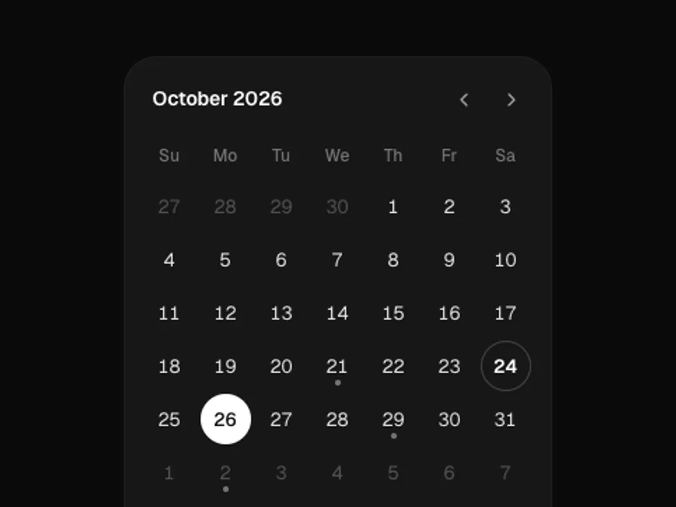
A month grid for one day, several days or a range, with keyboard navigation, markers and month and year dropdowns.

PreviousButtonsNextCheckboxes

On this page

RangeMultipleDisabled DaysWith EventsMonth and YearBooking

Calendar

motion · lucide-react

Range

mode="range" with months={2}: click a start, hover to preview, click an end.

Multiple

mode="multiple" toggles days on and off.

Disabled Days

min, max and a disabled function: weekdays only, from today to the end of next month, weeks start on Monday.

With Events

markers puts a dot on days with events; pick a day to list them.

Month and Year

captionLayout="dropdown" jumps across years, e.g. for a birthday.

Booking

variant="plain" inside a card, next to time slots.