Scalar UI
Marketing UIApp UIAIChartsBackgrounds
Sign inGet started
Scalar UI
Scalar UI© 2026 Scalar Limited

React · Tailwind CSS · Motion

Browse

HomeAll components 213

Collections

Marketing UI 107App UI 94AI 16Charts 45Backgrounds 2Text 43

More

Text 43

Getting started

Installation

Primitives

AccordionsAlert DialogsAlerts2Aspect RatiosAvatars2BadgesBreadcrumbsButton GroupsButtons2CalendarsCheckboxesCollapsiblesComboboxesCommand MenusContext MenusDate PickersDialogsDropdown MenusEmpty StatesFields2FormsHover CardsInput OTPInputs3KbdMenubarsNavigation MenusPaginationPassword InputsPopoversProgress2Radio GroupsResizableScroll AreasSelectsSeparatorsSheetsSkeletonsSlidersSpinnersSwitchesTablesTabsToastsToggles2ToolbarsTooltipsSortablesStatus DotsTree ViewsFile UploadsSteppers

Layouts

SidebarsNavbarsApp Shells

Blocks

SchedulersBoards3CanvasesWorkflowsAI apps4Developer tools3AuthenticationOnboardingSettingsPricing & upgrades2Help & feedback4System pages7Admin console

Other

Cards

Resources

Docs & installScalar Design
App UILayouts

Sidebars

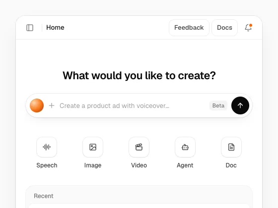
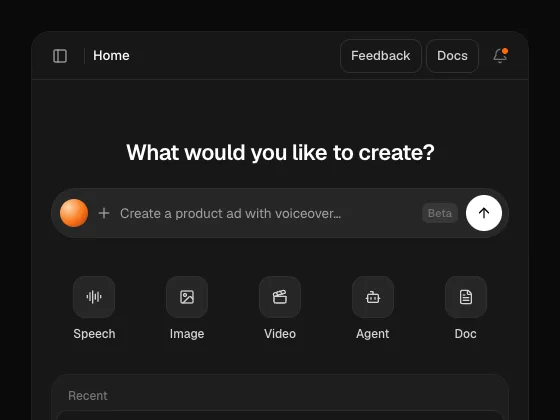
An app sidebar with groups, submenus, badges, a search field, workspace and account menus; collapses to icons or slides away, takes a dark tone or any colour through CSS variables, with a smooth or bouncy spring.
PreviousSteppersNextNavbars

On this page

DarkSectionsInsetFloatingBouncyDual RailWorkspace SwitcherFavourites and ProjectsRight Panel

Sidebar

radix-ui · motion · lucide-react

Dark

tone="dark" on a light page: a New issue button, team filters and an account menu beside a roadmap timeline.

Sections

A course header, groups that fold away, a settings submenu, and a Collapse row at the foot.

Inset

variant="inset": the sidebar blends into the shell, the page sits in a raised card and the active row is a white tile.

Floating

variant="floating": the sidebar is its own raised card, with labels and a compose button.

Bouncy

spring="bouncy" on the provider: width, labels and the sliding highlight overshoot a little.

Dual Rail

An app rail on the far left switches what the sidebar lists; collapsible="offcanvas" slides the panel away.

Workspace Switcher

A team menu at the top and a credits meter with an upgrade button at the bottom.

Favourites and Projects

Drag favourites to reorder them; projects open into their pages; the group label hides an add button.

Right Panel

A second provider inside the page holds a details panel on the right, toggled with its own shortcut.