Scalar UI
Marketing UIApp UIAIChartsBackgrounds
Sign inGet started
Scalar UI
Scalar UI© 2026 Scalar Limited

React · Tailwind CSS · Motion

Browse

HomeAll components 213

Collections

Marketing UI 107App UI 94AI 16Charts 45Backgrounds 2Text 43

More

Text 43

Getting started

Installation

Primitives

AccordionsAlert DialogsAlerts2Aspect RatiosAvatars2BadgesBreadcrumbsButton GroupsButtons2CalendarsCheckboxesCollapsiblesComboboxesCommand MenusContext MenusDate PickersDialogsDropdown MenusEmpty StatesFields2FormsHover CardsInput OTPInputs3KbdMenubarsNavigation MenusPaginationPassword InputsPopoversProgress2Radio GroupsResizableScroll AreasSelectsSeparatorsSheetsSkeletonsSlidersSpinnersSwitchesTablesTabsToastsToggles2ToolbarsTooltipsSortablesStatus DotsTree ViewsFile UploadsSteppers

Layouts

SidebarsNavbarsApp Shells

Blocks

SchedulersBoards3CanvasesWorkflowsAI apps4Developer tools3AuthenticationOnboardingSettingsPricing & upgrades2Help & feedback4System pages7Admin console

Other

Cards

Resources

Docs & installScalar Design
App UIBlocks

Canvases

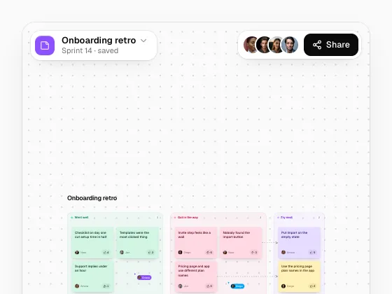
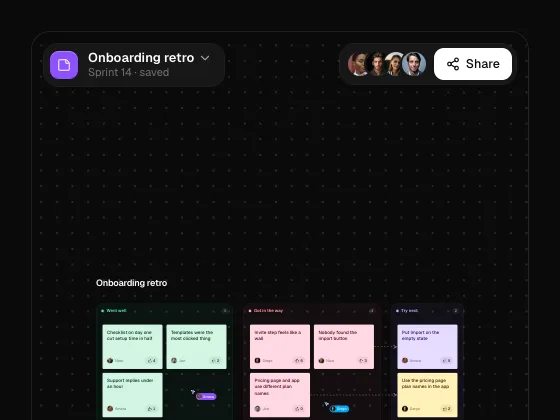
An infinite canvas: scroll or Space to pan, pinch or ⌘ + scroll to zoom to the cursor, box-select, drag with snapping, a scaling grid, zoom controls, fit and a minimap. CanvasPin places cursors; useCanvas drives toolbars. The demo is a retro board whose sections carry their stickies.
PreviousBoardsNextWorkflows

On this page

Mind MapMoodboard

Canvas

motion · lucide-react

Mind Map

A balanced mind map: branches fold away with a count, Tab adds a child, Enter a sibling, arrows move between topics; switch to a one-sided layout.

Moodboard

Photos, a palette you can copy from and a note on a line grid, snapping to 8; Add image drops a new one in.