Buttons
Tactile, animated calls to action.
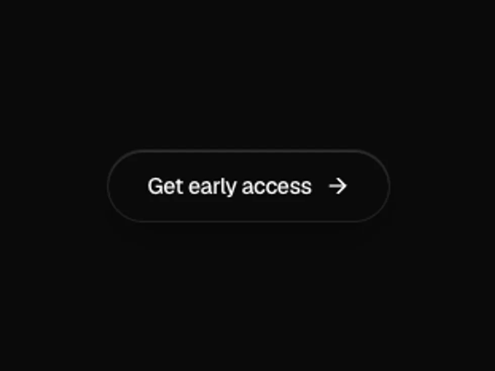
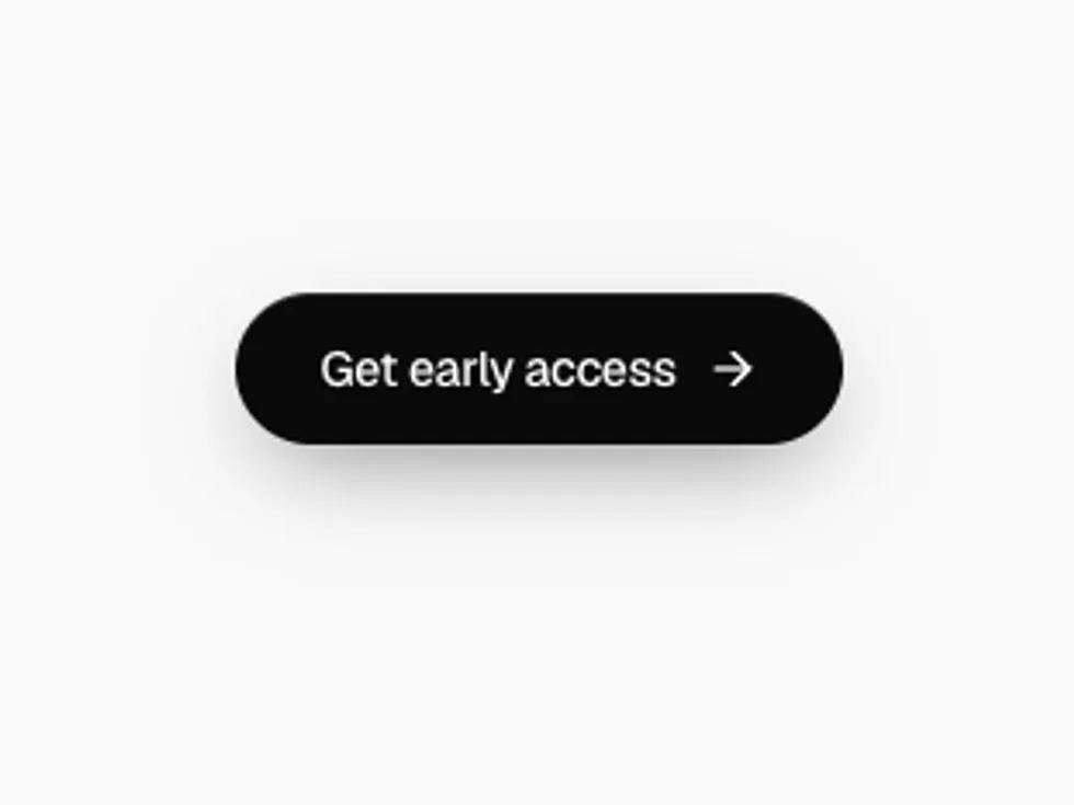
A pill button with a light sweep that glides across its surface.
motion · lucide-react
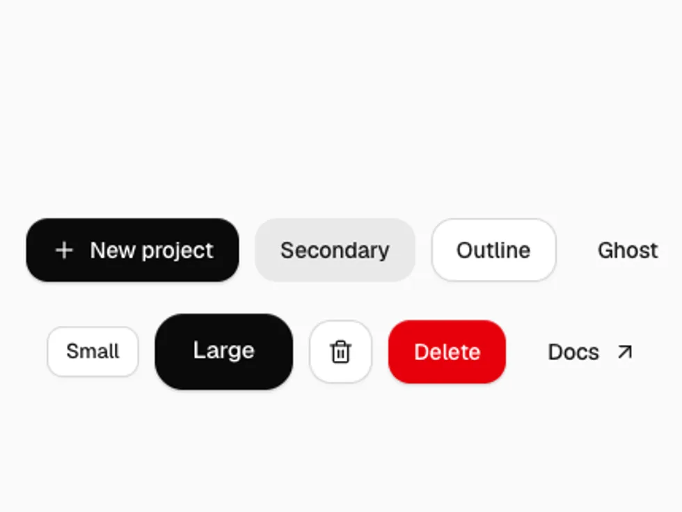
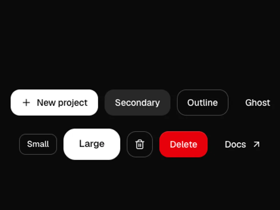
Seven variants, six colors, three shapes and four sizes on a Radix Slot, so links and router links can wear button styles through asChild.
radix-ui
The primary action on a page or in a form.
A quieter action that sits next to the primary one.
A bordered button for neutral actions.
No fill until hover, for toolbars and dense UI.
For actions that delete or can't be undone.
Every variant takes a color. Pick one to see the whole set change.
variant="highlight": a glossy top sheen and a colored glow that brightens on hover.
variant="raised": an inner border and a bottom edge that press down on click.
shape="pill" gives fully rounded ends.
shape="square" removes the corner radius.
Use the size prop: sm, md (default), lg or icon.
Square icon-only buttons. Give each one an aria-label.
Put a lucide icon before the label; it's sized for you.
Disable the button and show a spinning icon while work runs.
Use asChild to give a link, or a router Link, button styles.