Toggles
Buttons that stay on or off, alone or in a group.
Buttons that stay on or off, alone or in a group.
A ghost toggle that fills when pressed.
variant="outline" for toggles that sit on their own.
variant="raised": a raised key that presses in when it's on, for call controls.
An icon and a label; style the icon from the on state.
sm, md (default) and lg.
Disabled toggles keep their state but can't change.
A set of toggles where one or many can be on: a segmented control with a sliding pill, an attached outline group, or loose ghost items.
radix-ui · motion
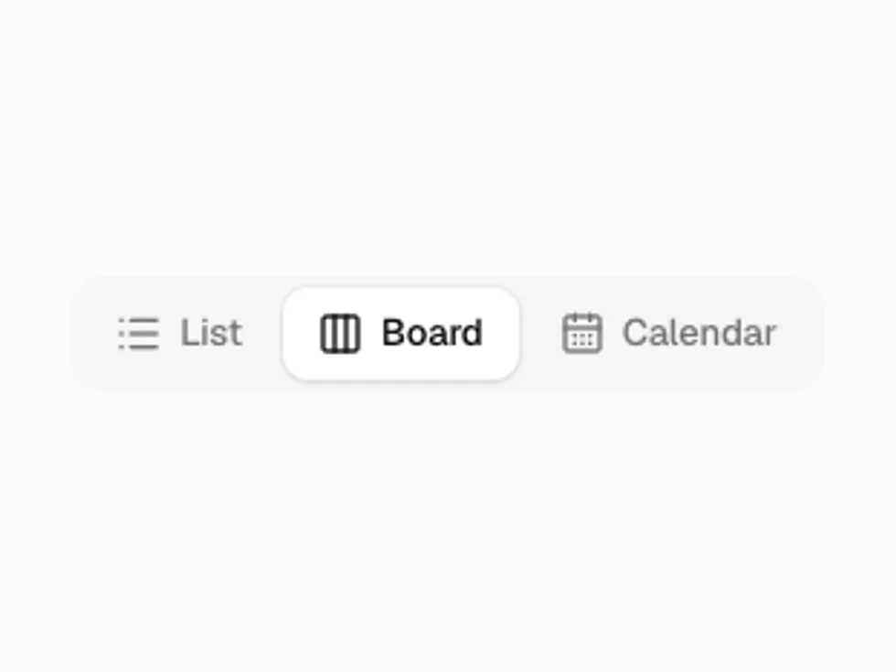
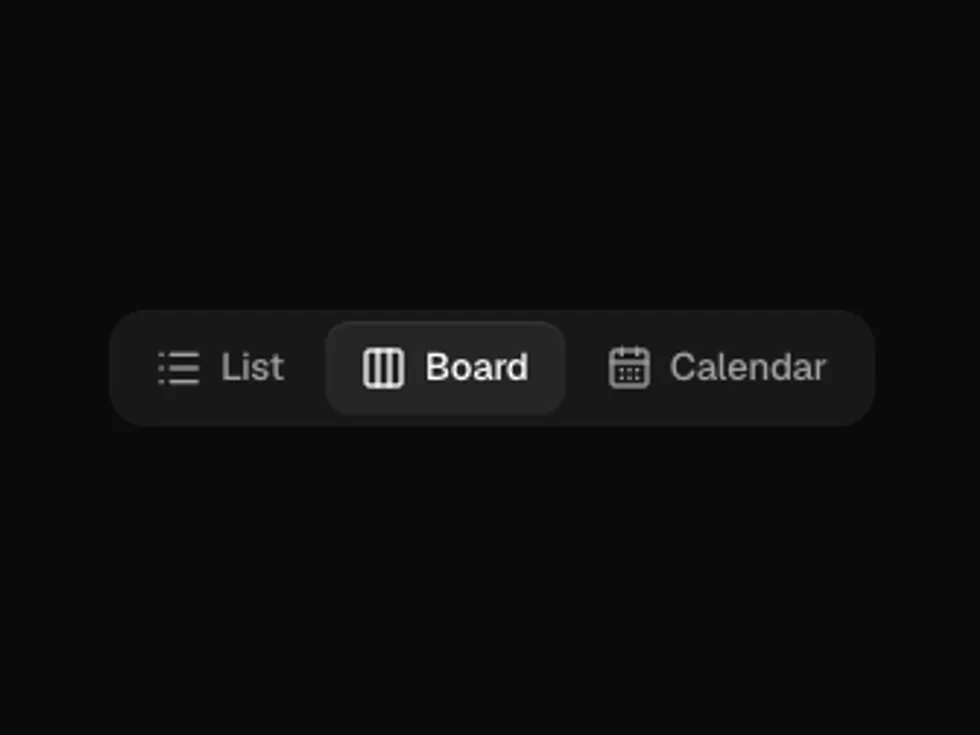
type="single": a pill glides to the chosen option, and one option always stays selected.
variant="outline" attaches the items into one bordered control.
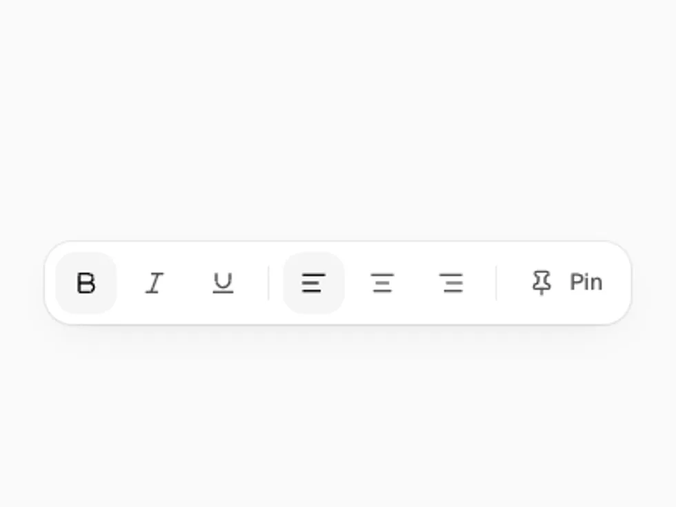
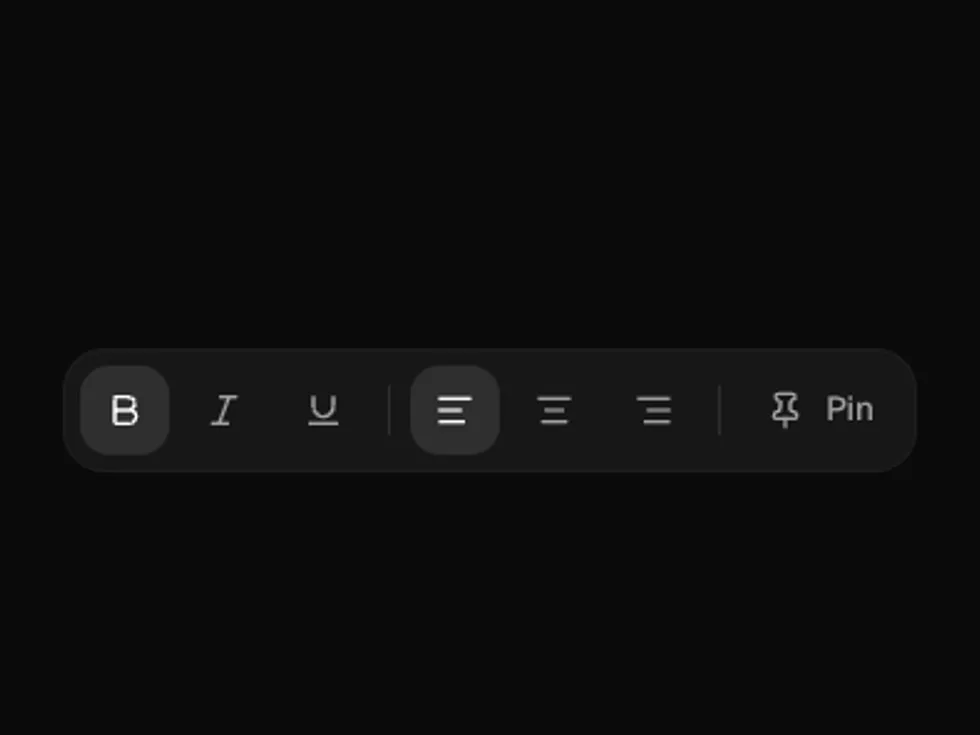
type="multiple" with variant="ghost", for formatting toolbars.
A small segmented control driving a price, with a badge inside an item.
orientation="vertical" for a settings section switcher.