Scalar UI
Marketing UIApp UIAIChartsBackgrounds
Sign inGet started
Scalar UI
Scalar UI© 2026 Scalar Limited

React · Tailwind CSS · Motion

Browse

HomeAll components 213

Collections

Marketing UI 107App UI 94AI 16Charts 45Backgrounds 2Text 43

More

Text 43

Getting started

Installation

Primitives

AccordionsAlert DialogsAlerts2Aspect RatiosAvatars2BadgesBreadcrumbsButton GroupsButtons2CalendarsCheckboxesCollapsiblesComboboxesCommand MenusContext MenusDate PickersDialogsDropdown MenusEmpty StatesFields2FormsHover CardsInput OTPInputs3KbdMenubarsNavigation MenusPaginationPassword InputsPopoversProgress2Radio GroupsResizableScroll AreasSelectsSeparatorsSheetsSkeletonsSlidersSpinnersSwitchesTablesTabsToastsToggles2ToolbarsTooltipsSortablesStatus DotsTree ViewsFile UploadsSteppers

Layouts

SidebarsNavbarsApp Shells

Blocks

SchedulersBoards3CanvasesWorkflowsAI apps4Developer tools3AuthenticationOnboardingSettingsPricing & upgrades2Help & feedback4System pages7Admin console

Other

Cards

Resources

Docs & installScalar Design
App UIPrimitives

Badges

Small labels in soft, solid and outline styles across five tones, with dots, icons, counts and a remove button.

PreviousAvatarsNextBreadcrumbs

On this page

VariantsTonesWith DotWith IconRemovableCountSize

Badge

lucide-react

Variants

soft (default), solid, outline and rounded.

Tones

neutral, blue, emerald, amber and red.

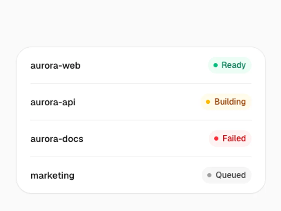
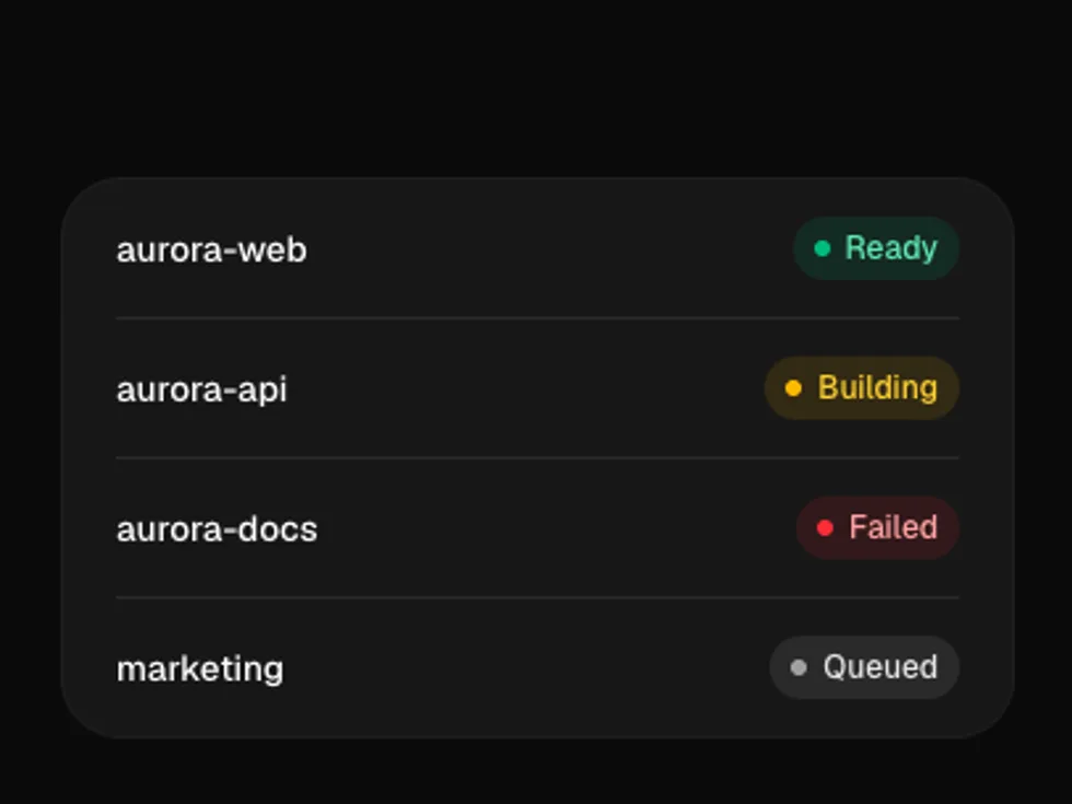
With Dot

dot for status.

With Icon

An icon before the label.

Removable

onRemove adds a small close button.

Count

A solid count pinned to an icon button.

Size

sm, md (default) and lg.